
Disy
Craft stunning SaaS interfaces in Figma with a comprehensive UI kit. Access customizable components, layout samples, and icons to design efficiently.
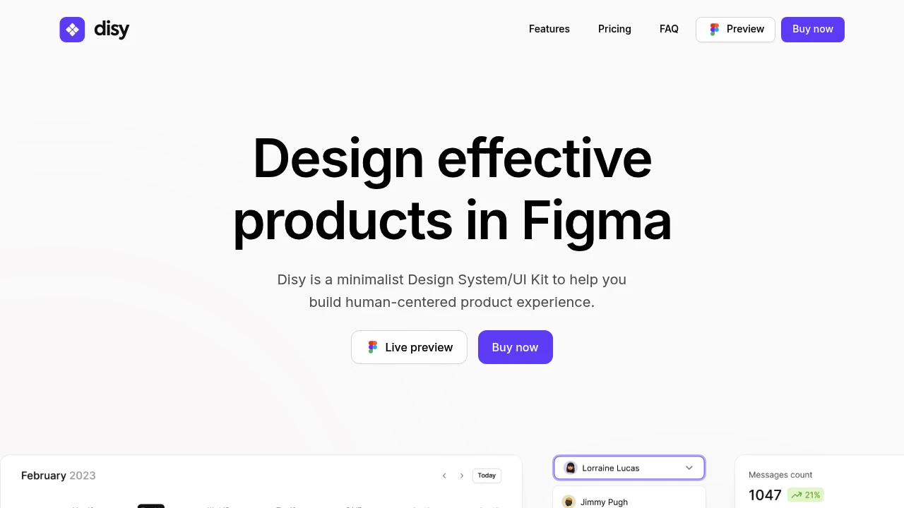
Design effective, human-centered products in Figma with this minimalist SaaS UI Kit and Design System. Spend less time reproducing elements and more time designing impactful interfaces. This comprehensive kit empowers you to customize colors, typography, and layouts effortlessly, ensuring your designs align perfectly with your brand identity or project requirements, all while maintaining a cohesive look.
Key features that accelerate your workflow:
- Extensive Component Library: Access over +2,000 handcrafted components and variants, including advanced, customizable elements, eliminating the need to build from scratch.
- Flexible Style Customization: Easily tailor global styles to match your brand, ensuring a consistent visual language across your product.
- Inspirational Samples: Explore dozens of handmade design samples to spark creativity and visualize possibilities for your product designs.
- Solid Foundation: Built on a 4px grid system for consistent, scalable interfaces and includes +600 open source icons.
- Modern Figma Workflow: Leverages the latest Figma features for an optimized design process.
- All-in-One Solution: Everything you need is conveniently organized in a single Figma file.
Categories:

 Untitled UI
Similar to Disy:

Design and development perfectly aligned.
FigmaReact+1 more
Achieve consistent UI and quick development with flexible React components styled with TailwindCSS. Offers easy integration and Figma alignment for seamless workflows.

Design with clarity. Build with confidence.
CompanyFigma+1 more
Ship quality Atlassian interfaces using robust foundations, versatile components, and powerful tools. Design with clarity and build with confidence.

Design modern UIs faster in Figma. Eliminate tedious tasks.
Figma
Build visually appealing, consistent web UIs with an advanced Figma design framework. Offers 1400+ components, one-click dark mode, and easy customization.