
Camp Design System
Access detailed design guidelines and a complete design system documentation. Create consistent, scalable product experiences with a rich component library.
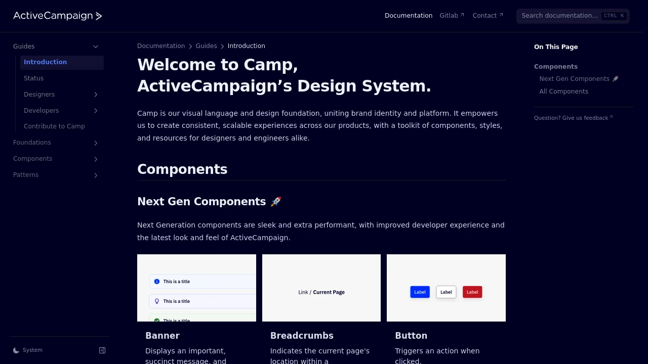
Discover a comprehensive design system that serves as the visual language and foundational toolkit for building cohesive user interfaces. This system unites brand identity with platform functionality, enabling the creation of consistent and scalable experiences across various products. It provides designers and engineers with a rich set of resources, including:
- Detailed Guides: For both designers and developers, ensuring clear understanding and implementation.
- Foundational Tokens: Standardized values for colors, typography, and spacing to maintain visual harmony.
- Extensive Component Library: A vast collection of reusable UI elements such as Accordions, Avatars, Buttons, Cards, Data Visualization tools, Modals, Input fields, and many more, including Next Gen Components for enhanced performance and modern aesthetics.
- Design Patterns: Established solutions for common design problems to accelerate workflow.
By leveraging these tools, teams can accelerate development cycles, ensure brand alignment, and deliver high-quality, user-friendly interfaces efficiently.

 Untitled UI
Similar to Camp Design System:

Unified design for seamless experiences.
Company
Access integrated guidelines for components, interactions, and visual style. Create consistent, user-friendly experiences and boost design workflow efficiency.

Never miss a website outage or slowdown again.
CompanyFigma+1 more
Workbench design system contains documentation, tools, and standards that enable us to develop beautiful, cohesive, and accessible experiences for Gusto's platform.

Build consistent, high-quality UIs with shared resources.
CompanyFigma+2 more
Access a comprehensive design system with components, standards, and tools to build cohesive, high-quality user interfaces for products.