
Flowbite
Develop websites faster with 600+ Tailwind CSS UI components, Figma designs, dark mode, RTL support, and free SVG icons & illustrations.
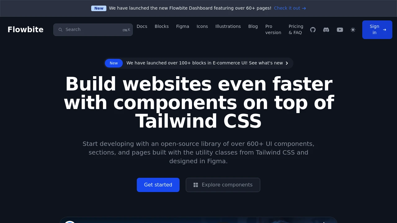
Accelerate your web development with a comprehensive open-source library built on Tailwind CSS. Access over 600+ UI components, sections, and pages, all meticulously designed in Figma to ensure a seamless workflow from design to code. This powerful toolkit helps you build websites significantly faster.
Key features include:
- Extensive Component Library: Over 67 open-source UI components and 400+ block sections ready to use.
- Figma Design System: Leverage a definitive design system with variants, properties, auto-layout, dark mode, and responsive support.
- Native Dark Mode: Components automatically switch to dark mode based on browser settings or custom configurations, enhancing accessibility and user experience.
- Full RTL Support: Built-in support for right-to-left languages like Arabic and Hebrew using logical properties from Tailwind CSS.
- Free SVG Assets: Access a rich collection of over 400+ SVG icons (solid and outline styles) and 50+ SVG illustrations (3D style, dark/light mode), all compatible with Tailwind CSS and Figma.
- Framework Compatibility: Open-source component libraries are also available for popular frameworks such as React, Vue.js, Svelte, and Angular.
- AI-Powered Generation: Utilize a custom trained GPT model to generate UI components, sections, pages, and code snippets based on the library's extensive resources.
For users seeking even more advanced features, a Pro version offers hundreds of additional UI components and templates for Application, Marketing, Publisher, and E-commerce categories, with ongoing development for React and TypeScript support.
Categories:

 Untitled UI
Similar to Flowbite:

Build experiences that inspire people.
CompanyFigma+1 more
Access a comprehensive design system to build inspiring user experiences. Includes Figma libraries, plugins, and engineering resources for development.

Build better government digital services, faster, together.
GovernmentReact
Develop accessible, responsive government digital services efficiently. Utilize a framework with tested components, modern code, and community support for consistent user experiences.

Build consistent, accessible, delightful user experiences.
CompanyFigma
Access open source building blocks to design and implement consistent, accessible, and delightful product experiences. Includes foundations, content guidelines, components, and patterns.