
Geist
Build consistent, accessible, and delightful web experiences with a comprehensive open-source design system. Offers pre-built components and clear guidelines.
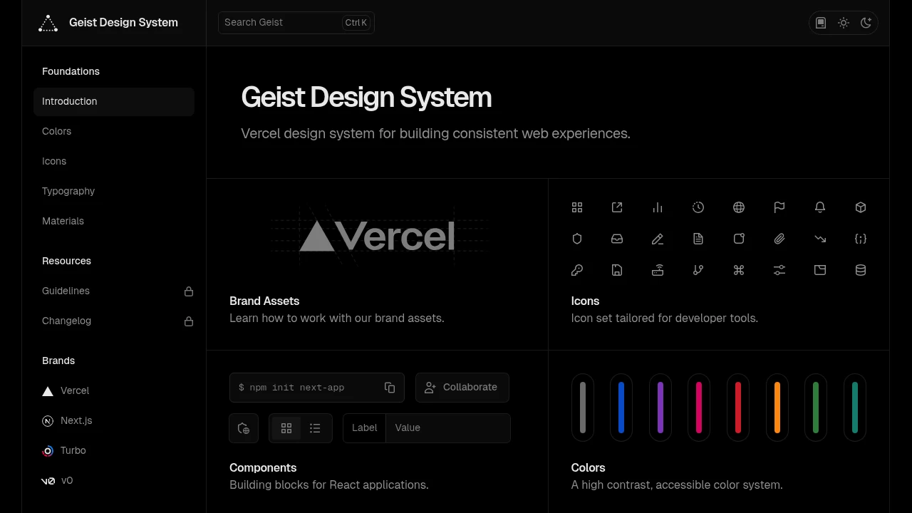
Geist is Vercel's open-source design system, meticulously crafted to help developers and designers build consistent, accessible, and delightful web experiences. It provides a comprehensive foundation for creating cohesive user interfaces with a focus on modern aesthetics and usability.
Key benefits and features include:
- Extensive Component Library: Access a wide array of pre-built, production-ready UI components, from basic elements like buttons and icons to complex patterns. This significantly speeds up development.
- Robust Design Tokens: Utilize a well-defined system of design tokens for colors, typography, spacing, and shadows, ensuring visual consistency across all parts of your application.
- Accessibility Focused: Built with accessibility in mind, helping you create interfaces that are usable by a wider audience.
- Developer-Friendly: Designed for ease of integration and customization, with clear documentation and support for modern development workflows.
- Brand Cohesion: Establish and maintain a strong, consistent brand identity across multiple digital products.
By adopting this system, teams can improve their design and development process efficiency, reduce inconsistencies, and ultimately deliver higher-quality, polished web applications.
Categories:

 Untitled UI
Similar to Geist:

Full-featured design system for digital experiences.
CompanyReact
Build complete and enjoyable digital experiences with this open-source design system. Ideal for designers and developers seeking consistency and quality.

Build consistent, high-quality UIs with shared resources.
CompanyFigma+2 more
Access a comprehensive design system with components, standards, and tools to build cohesive, high-quality user interfaces for products.

Your guide to consistent, scalable UI development.
CompanyFigma+1 more
Access detailed design guidelines and a complete design system documentation. Create consistent, scalable product experiences with a rich component library.