Keep Design System
Build stunning UIs with a comprehensive library, Figma tokens, React components, and built-in dark mode. Accelerate your workflow and save design time.
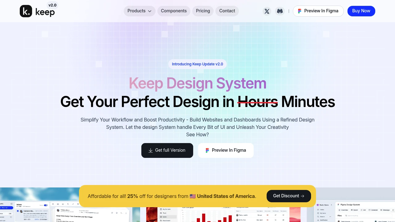
Simplify your design and development with a comprehensive UI library featuring numerous component variants, integrated Figma token variables, and a built-in dark mode. This system helps you create visually stunning user interfaces efficiently, saving significant time. It bridges the gap between design and development, promoting a smoother handoff.
Leverage over 40+ open-source React UI components and interactive elements to build captivating projects. All components are modernly crafted, adhering to latest industry standards and trendy styles. Access a vast library of ready-to-use UI elements, such as:
- Buttons and checkboxes
- Dashboards and charts
- Forms and interactive elements
Benefit from design tokens linked with Figma Variables for consistent design application across projects with a single click. This ensures brand coherence and speeds up updates. Enjoy lifetime updates, guaranteeing access to the latest features and improvements. Upcoming additions include dynamic dashboards, customizable templates, and a Tailwind CSS version, enhancing your creative capabilities.

 Untitled UI