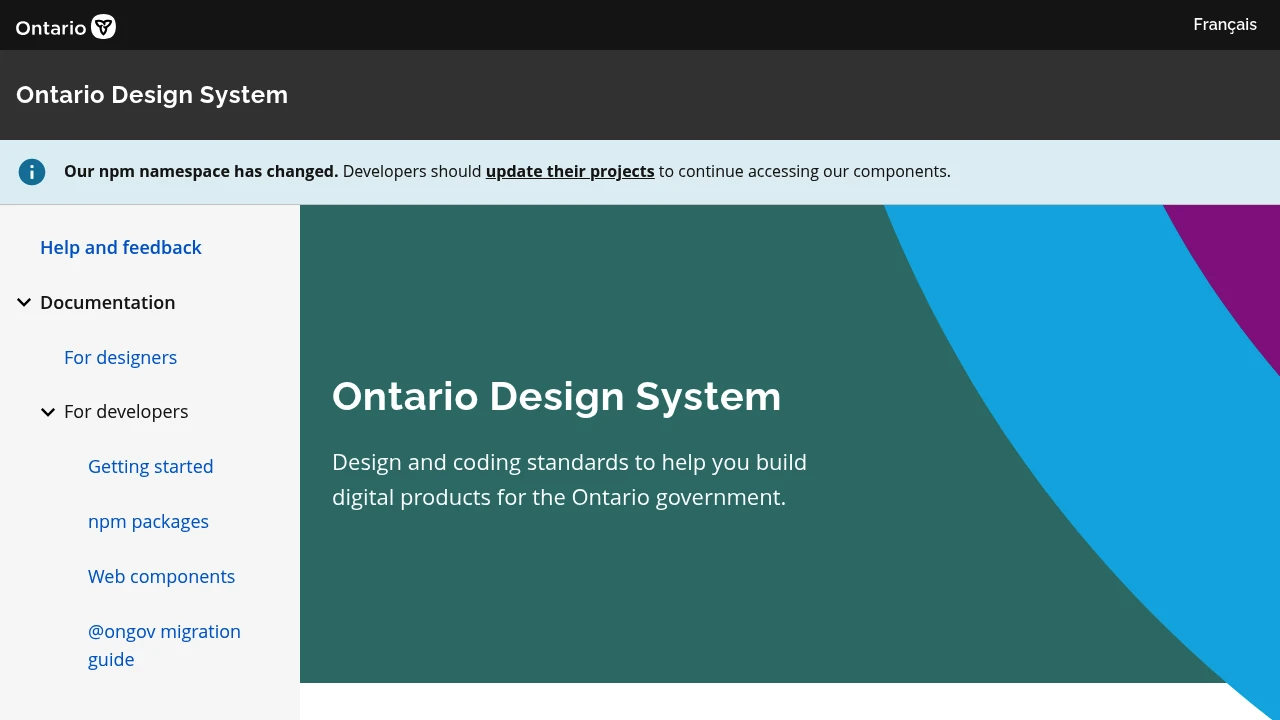
Ontario Design System
Create consistent, accessible government digital products with established design and coding standards. Ensures brand alignment and utilizes tested code components.

The Ontario Design System offers a comprehensive suite of design and coding standards to guide the creation of digital products for the Ontario government. It functions as a library of reusable components, including elements like buttons, navigation, and form fields, with clearly defined visual styles and interactive behaviors. Adopting this system helps ensure that Government of Ontario products maintain a consistent look and feel, adhere to the Ontario brand guidelines, utilize reliable, pre-tested code, and meet crucial accessibility requirements. This approach promotes a unified user experience across all governmental digital platforms.
For designers, the system provides resources for creating mockups and prototypes. For developers, it offers detailed guidance for coding websites and applications. By leveraging these established standards, teams can build high-quality, user-friendly digital services more efficiently.