
Primer
Develop consistent user interfaces and brand experiences for GitHub using a comprehensive design system with pre-built components, icons, and design tokens.
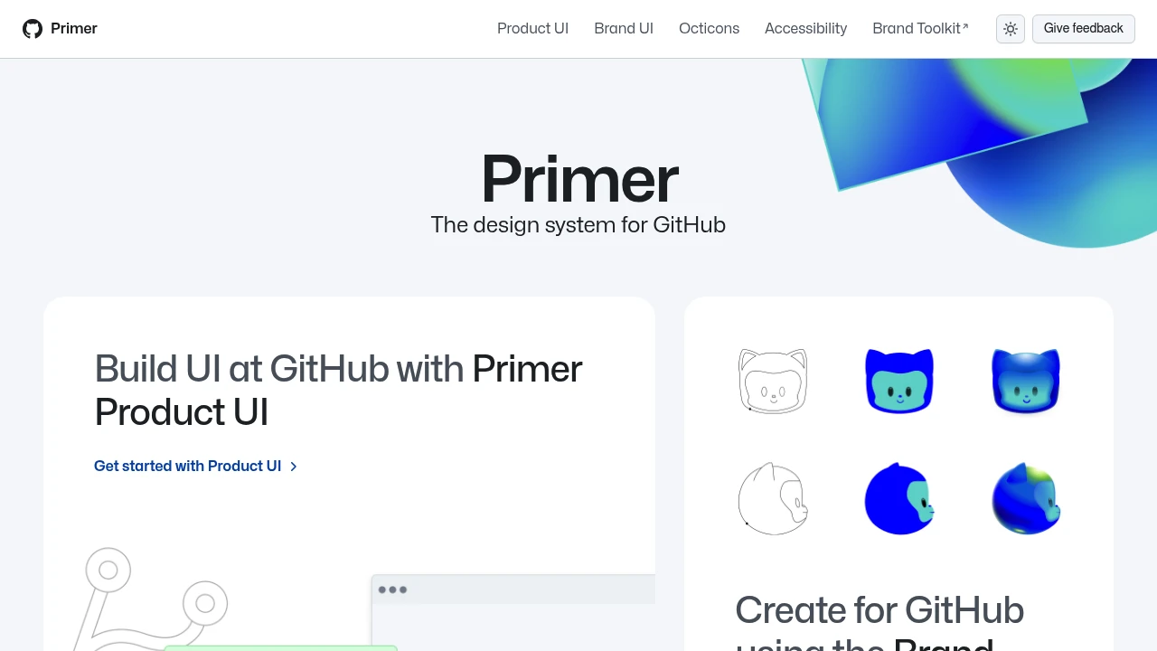
Primer is GitHub's comprehensive design system, created to help build consistent and accessible user interfaces and brand experiences across the GitHub platform. It provides a robust foundation for designers and developers working on GitHub-related projects.
Key components and resources include:
- Primer Product UI: A dedicated toolkit for building user interfaces directly within GitHub products.
- Brand Toolkit: Resources for creating assets and experiences that align with the GitHub brand.
- Primer Brand UI: Specifically for designing digital marketing experiences that resonate with the GitHub identity.
Primer also offers shared foundational elements to ensure consistency and quality:
- Accessibility Guidelines: Tools and guidance for creating inclusive and accessible interfaces for all users.
- Octicons: A rich library of SVG icons designed by GitHub, for GitHub.
- Design Tokens: Pre-defined values for color, spacing, and typography, facilitating a unified visual language.
This system is essential for anyone contributing to the GitHub ecosystem, ensuring a cohesive and high-quality user experience. You can also stay updated with the latest advancements in design at GitHub and learn more about the core team behind this design system.
Categories:

 Untitled UI
Similar to Primer:

Craft consistent, user-friendly digital experiences.
Company
Build consistent, accessible digital experiences with a comprehensive system of styles and scalable components. Create intuitive interfaces guided by user-centric principles.

Building cohesive Wikimedia experiences.
CompanyFigma
Build consistent, accessible, and user-friendly interfaces for Wikimedia projects. Access a comprehensive library of components and guidelines.

Craft inclusive web apps with a proven design system.
CompanyFigma+1 more
Build intuitive, accessible web experiences at scale. Access UI guidelines, React components, design resources, and dev tools for faster, inclusive development.