
Sage
Access design foundations, versatile components (Rails/React), layout tools, and developer guides for creating cohesive digital products. Supports SCSS & JS.
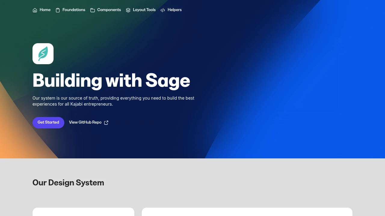
This comprehensive design system serves as the single source of truth for building exceptional user experiences. It provides a robust framework with everything needed to design and develop consistently across projects, specifically for entrepreneurs.
The system is built upon solid foundations including typography, color palettes, and icon sets, along with prescribed best practices. At its heart are versatile Components, available in both Rails and React, complete with code examples, property options, best practices, and links to Figma design documentation. Layout Tools offer flexible content positioning without altering the content itself. While Interactions are forthcoming, they will provide a guided list of common interactive experiences. Helpers are designed to give the system the flexibility developers require for use at scale.
Getting started is made easy with practical developer guides designed for quick onboarding. Contribution from the team is highly encouraged to ensure the system's longevity and continuous improvement.
Technologically, the system utilizes:
- A language-agnostic SCSS system for styling across various application code choices.
- Custom Rails View Components as the default approach.
- Clean, minimal Vanilla JavaScript for essential interactions and accessibility features.
- React Components for scenarios requiring heavy state and interaction management.

 Untitled UI