
AlignUI
Achieve consistent UI and quick development with flexible React components styled with TailwindCSS. Offers easy integration and Figma alignment for seamless workflows.
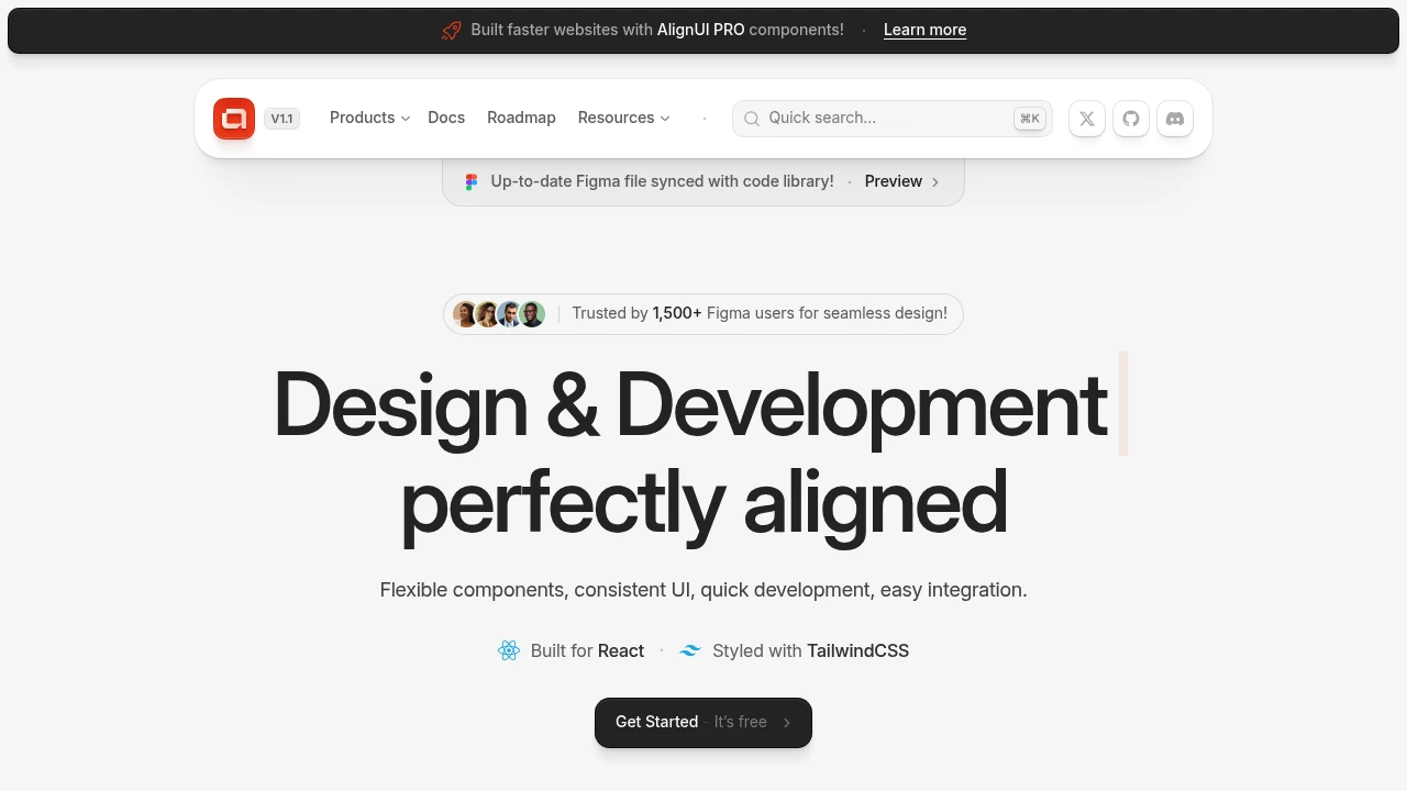
Bridge the gap between design and development with a comprehensive system built for React and styled with TailwindCSS. Offering over 40+ free, open-source base components and an extensive PRO version with 100+ ready-made components, blocks, and sectoral templates, this tool facilitates rapid development and consistent UI. The PRO version also includes an always-updated Figma file library, ensuring your designs are perfectly aligned with development.
Key benefits include:
- Flexible Components: Access over 180+ versatile UI elements (500+ with PRO) for rapid development.
- Production Ready: Utilize pre-optimized code for immediate project deployment.
- Figma Integration: Work with a comprehensive design kit for a smooth UI/UX workflow.
- Highly Customizable: Easily tailor components to your unique brand identity and project needs.
- Responsive Design: Ensure adaptive layouts across all devices for a consistent user experience.
- Developer-Friendly: Leverage an intuitive framework for efficient and rapid development.
- Dark Mode: Implement effortless integration for enhanced user experience.
- TypeScript Support: Benefit from strong typing for improved code maintainability.
- Accessibility: Build with WCAG-compliant design for inclusive user access.
Whether you're starting with the free base components or leveraging the extensive PRO library, achieve seamless integration and build unique designs faster.
Categories:

 Untitled UI React
 Untitled UI
Similar to AlignUI:

Build accessible React apps faster with versatile components & hooks.
React
Accelerate web application development with a comprehensive React library offering 120+ customizable components, 70+ hooks, and robust styling for accessible UIs.

Beautiful, usable products, built faster.
CompanyFigma
Develop beautiful, usable digital products faster. Create high-quality user experiences with an adaptable, open-source framework and comprehensive guidelines.

Craft consistent e-commerce UIs with flexible React primitives.
CompanyFigma+2 more
Build consistent user interfaces for e-commerce applications with a React-based design system. Access components, hooks, icons, and utilities.