
Washington Post Design System (WPDS)
Access design tokens and interactive components to build modular, elegant, and accessible digital products with visual consistency at scale.
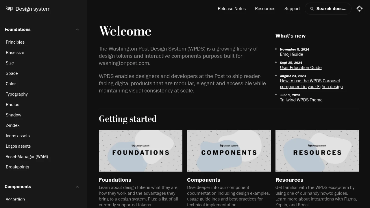
The Washington Post Design System (WPDS) is a comprehensive resource providing a growing library of design tokens and interactive components. These are purpose-built for washingtonpost.com, enabling designers and developers to create reader-facing digital products that are modular, elegant, and accessible. A key benefit is the ability to maintain visual consistency at scale across all digital touchpoints. WPDS facilitates faster development cycles and ensures a cohesive user experience. The system includes:
- Detailed documentation for design tokens.
- A wide range of interactive components.
- Guidelines for achieving accessibility standards.
- Resources for engineering contributors to get started and dive deeper. By using WPDS, teams can focus on delivering high-quality content and innovative features, backed by a robust and consistent design foundation.

 Untitled UI
Similar to Washington Post Design System (WPDS):

Your guide to consistent, scalable UI development.
CompanyFigma+1 more
Access detailed design guidelines and a complete design system documentation. Create consistent, scalable product experiences with a rich component library.

Never miss a website outage or slowdown again.
CompanyFigma+1 more
Workbench design system contains documentation, tools, and standards that enable us to develop beautiful, cohesive, and accessible experiences for Gusto's platform.

Unified design for seamless experiences.
Company
Access integrated guidelines for components, interactions, and visual style. Create consistent, user-friendly experiences and boost design workflow efficiency.