
Backpack
Develop intuitive, traveller-first digital products using a complete design system. Access guidelines, components, and tools for consistent, efficient creation.
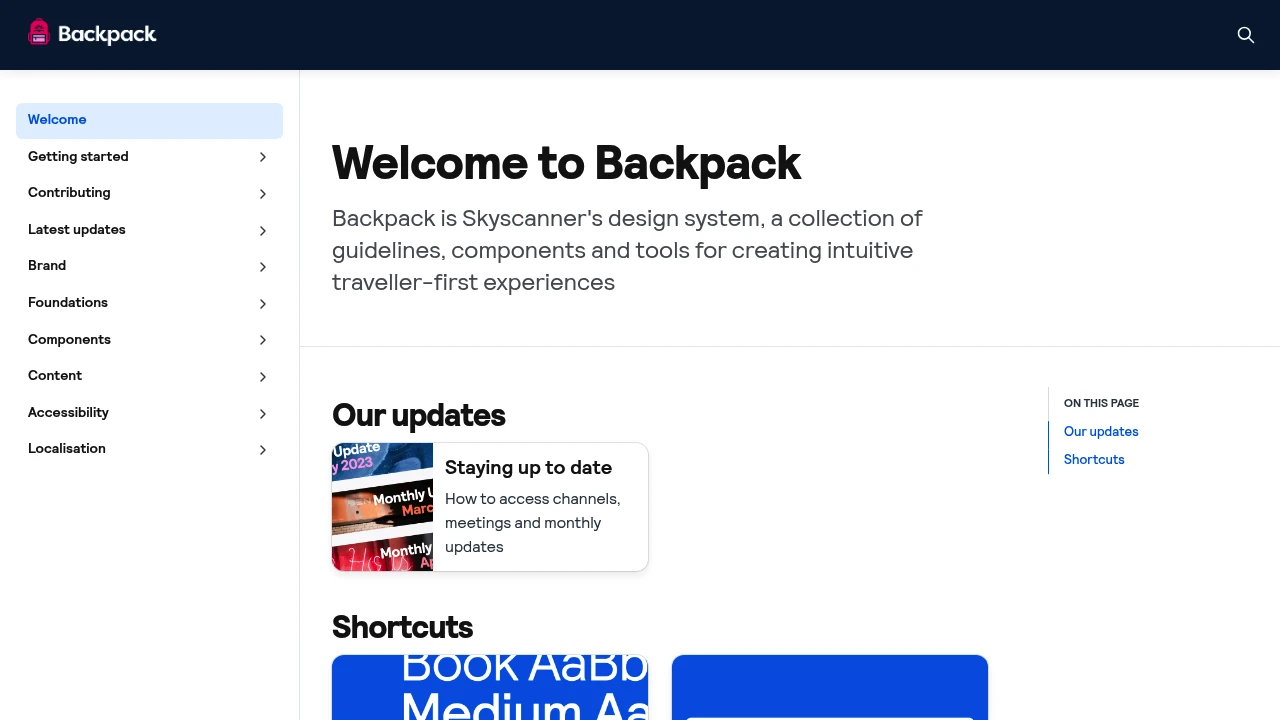
Discover a comprehensive design system built to foster intuitive, traveller-first experiences. This system provides a unified collection of:
- Clear guidelines: Establishing consistent design principles for all digital touchpoints.
- Versatile components: A robust library of ready-to-use UI elements that speed up development.
- Practical tools: Resources designed to support creators in building cohesive and user-friendly products. By utilizing these elements, teams can ensure brand consistency, accelerate the design and development process, and ultimately deliver superior digital experiences for travellers worldwide. It's the foundation for creating memorable and effective travel solutions.

 Untitled UI
Similar to Backpack:

Easily build accessible, mobile-friendly government sites.
FigmaGovernment+1 more
Facilitates building accessible, mobile-friendly government websites. Offers components, patterns, design tokens, and utilities for consistent, inclusive user experiences.

Consistent, accessible government digital experiences.
FigmaGovernment
Create consistent, accessible government digital products with established design and coding standards. Ensures brand alignment and utilizes tested code components.

Build better government digital services, faster, together.
GovernmentReact
Develop accessible, responsive government digital services efficiently. Utilize a framework with tested components, modern code, and community support for consistent user experiences.