Intent UI
Create accessible web interfaces with customizable React components. Includes Tailwind CSS for styling and supports easy copy-paste integration.
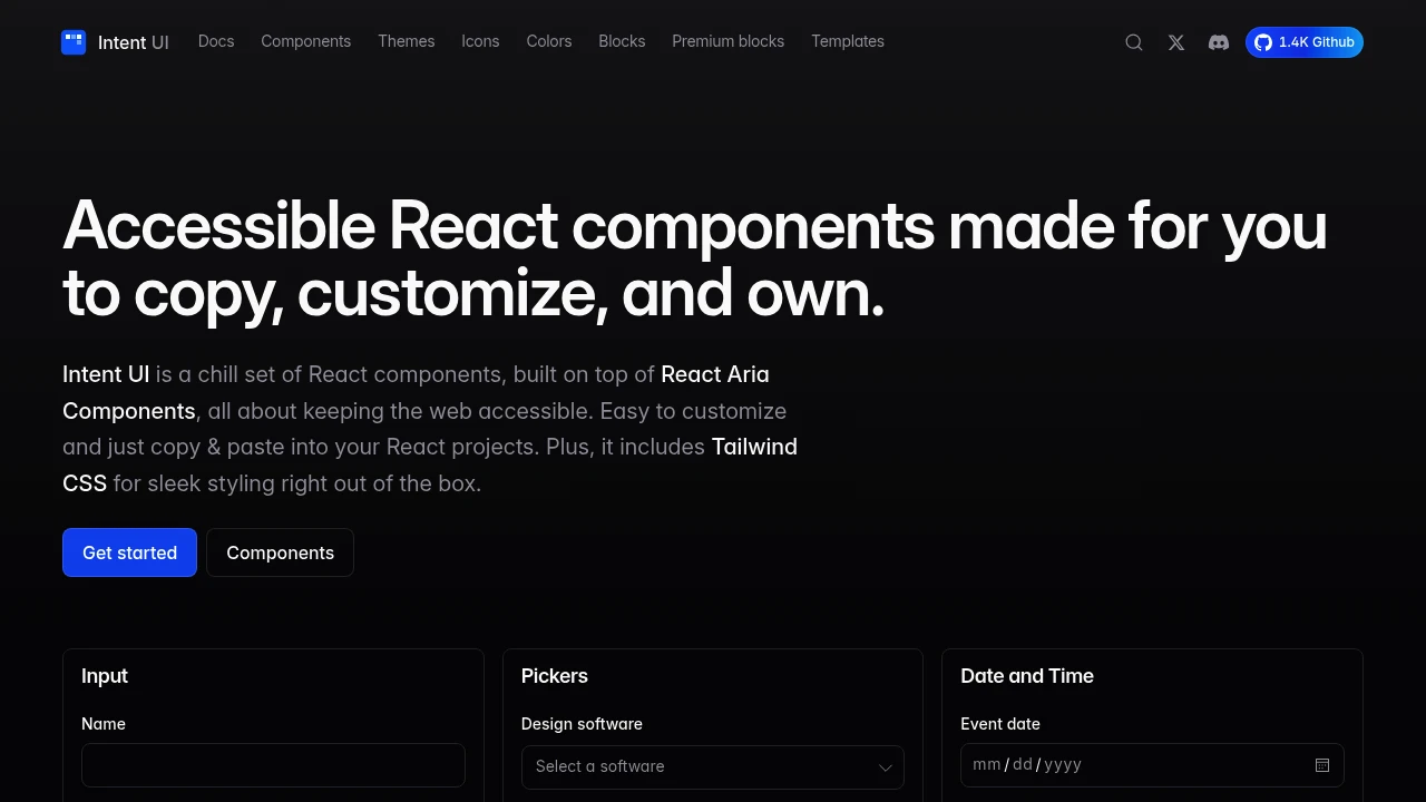
Develop modern, inclusive web applications with a comprehensive set of accessible React components. Built upon the robust React Aria Components, these elements prioritize accessibility, ensuring your projects are usable by the widest possible audience. Each component is designed to be highly customizable, allowing you to tailor the look and feel to match your brand identity perfectly. Integration is straightforward: simply copy and paste the components into your React projects.
Key benefits include:
- Accessibility First: Adherence to ARIA standards for inclusive design.
- Tailwind CSS Integration: Comes with Tailwind CSS for sleek, responsive styling right out of the box, reducing setup time.
- Developer-Friendly: Easy to use and integrate, speeding up your development workflow.
- Full Ownership: Customize and own the components you use.
The library includes a variety of common UI elements such as inputs, pickers, date and time selectors, dialogs, and more. Beyond components, you also get access to Intent Icons, a versatile open-source SVG icon library featuring over 1,191 symbols. These icons can be used independently or alongside the UI components. The project is open source, with its codebase available on GitHub, encouraging community involvement and contributions. Starter kits and pre-designed Intent Blocks are also provided to help you build your ideas even faster.

 Untitled UI