
Practical UI
Accelerate your design workflow with a comprehensive UI kit. Features prebuilt components, styles, variables, and ensures accessibility (WCAG 2.1 AA).
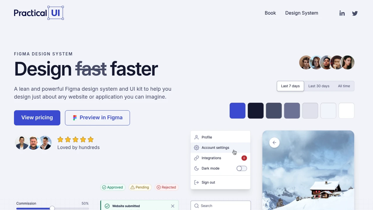
A lean and powerful Figma design system and UI kit designed to help you create virtually any website or application with speed, accessibility, and usability at its core. Design significantly faster with a comprehensive set of predefined styles for colors, typography, and spacing, alongside hundreds of component variants. This system is built with Figma's latest features from 2025, including optimized auto layout, variables, properties, and variants, making customization quick and effortless. Every component is crafted with usability in mind and is 100% WCAG 2.1 level AA compliant, ensuring an intuitive and beautiful user experience.
Key features include:
- Customizable Styles: Leverage the power of variables to easily adapt color and typography styles to your brand, including support for light & dark modes, spacing variables, elevation shadows, and 4px layout grids.
- Intuitive Component Library: Access a vast collection of components with hundreds of variants, powerful properties, and designed according to best practices. They are easy to use, customize, and feature interaction states for prototyping and auto layout.
- Pixel-Perfect Icons: Includes over 300 open-source Feather icons, designed on a 24px grid with a 2px stroke weight.
Categories:

 Untitled UI
Similar to Practical UI:

Design modern Saas UIs faster in Figma.
Figma
Craft stunning SaaS interfaces in Figma with a comprehensive UI kit. Access customizable components, layout samples, and icons to design efficiently.

Reimagine commerce with this starter kit.
CompanyFigma+1 more
Develop and enhance Shopify admin interfaces using this comprehensive starter kit. Build, contribute, and evolve merchant experiences for reimagined commerce.

Build beautiful interfaces, incredibly fast.
FigmaFramer
Create stunning interfaces rapidly using a comprehensive design system and UI kit for Figma and Framer. Access powerful components, variables, and auto-layout.