
Reshaped
Accelerate product development with professionally crafted React & Figma component libraries. Build scalable, themeable, and accessible UIs efficiently.
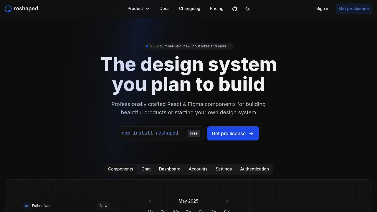
Develop and design products more efficiently with a comprehensive suite of professionally crafted component libraries for React and Figma. This system is engineered to accelerate your workflow, enabling you to build beautiful, scalable applications faster than ever. The React and Figma components are perfectly aligned, ensuring consistency from design to code, and feature extensive support for Figma variables.
Key benefits include:
- Atomic component approach: For maximum flexibility and reusability.
- No heavy dependencies: Relies only on React, avoiding CSS-in-JS lock-in.
- Server-side rendering compatibility: Works seamlessly with frameworks like Next.js and Vite.
- Automatic dark mode: Semantic tokens handle themes and color modes effortlessly, even for custom components.
- Responsive styles: Easily adjust styles for different viewports without custom media queries.
- Full accessibility: All components are WCAG and WAI-ARIA compliant.
- TypeScript support: Enjoy full typing for component properties, autocompletion, and error validation.
- Detailed documentation and theming tools: Including a CLI for custom themes and TailwindCSS integration.
For teams looking to build their own design system, the Pro license offers full source code access, a complete repository setup with linting, testing, and release scripts, and an extensive test suite. This allows you to customize components or start your own design system instantly, saving weeks of setup time.
Categories:

 Untitled UI
Similar to Reshaped:

Build better travel experiences, faster.
CompanyFigma+1 more
Develop intuitive, traveller-first digital products using a complete design system. Access guidelines, components, and tools for consistent, efficient creation.

Unified framework for cohesive product interfaces.
CompanyFigma+1 more
Establish consistent UI foundations across a product ecosystem. Unify diverse experiences with a comprehensive framework covering styles, expression, content, and accessibility.

Build accessible UIs with total style freedom.
React
Build accessible web apps and design systems with unstyled, highly customizable UI components. Gain full styling control and ensure inclusivity.