
Sort UI
Accelerate your design workflow with premium UI kits for Figma and Framer. Access high-quality, customizable components, variables, and themes for faster project launches.
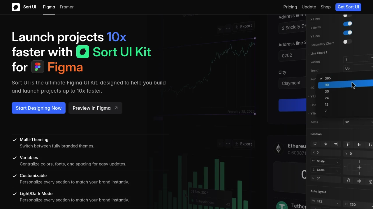
Accelerate your design process significantly with this ultimate Figma UI Kit, engineered to help you build and launch projects up to 10x faster. It offers a comprehensive suite of tools perfect for Startups and Freelancers looking to enhance efficiency and produce high-quality designs.
Key features include:
- Multi-Theming: Effortlessly switch between fully branded themes.
- Variables: Centralize colors, fonts, and spacing for easy global updates.
- Highly Customizable: Instantly personalize every section to align with your brand identity.
- Light/Dark Mode: Create designs adaptable to any user environment with built-in themes.
- Interactive Components: Improve your prototyping workflow with fully interactive elements, simplifying testing and handoff.
- Auto Layout: All components automatically resize and reflow as needed.
Built leveraging Figma’s most powerful features, this kit allows you to easily design and customize interfaces and applications. It includes pre-built UI components and SaaS application design templates to jumpstart your projects. With over 600 ready-to-use variables for colors and typography, plus customizable spacing and corner radius, tailoring designs to your specific needs is straightforward. The kit also features a Landing Page Builder with responsive blocks and receives regular updates, ensuring you always have access to the latest design trends and features.

 Untitled UI